
Flower Shop Website Design: A Florist's Guide
A useful flower shop website helps a customer choose an arrangement and understand how it will reach the recipient. Start with those decisions, then choose the visual style. This guide is a design review checklist, not a promise that a particular template or app will increase sales.
Show the arrangement the customer can actually order
Photograph your own arrangements in the sizes you sell. Label each size beside its image, explain whether the vase is included, and state how seasonal substitutions are handled. Keep the background and lighting consistent so customers can compare products. If an image is illustrative, say so rather than presenting it as a photograph of the exact item.
Check the product grid and the full product page on a phone. Can you see the whole bouquet? Can you distinguish the available sizes without zooming? A tall arrangement should not lose its top simply because the template uses a wide image crop.
Give shoppers a clear route by occasion
Group products around the reasons your customers buy: birthdays, anniversaries, sympathy, congratulations or everyday gifts. Keep flower and color filters available if they help your audience. Use straightforward category names and make it easy to return to the previous collection without losing the selected product.
For sympathy and funeral purchases, keep timing and contact details easy to find. Avoid placing an intrusive promotion between the shopper and essential delivery information. Ask someone unfamiliar with your site to find a suitable arrangement and explain where they became uncertain.
State delivery limits before asking for payment
Show your service area, delivery days, same-day cutoff and the time zone used for that cutoff. Explain pickup separately. Put these details near the product decision as well as on a dedicated delivery page. If an address checker gives an estimate, label it as an estimate and verify what the customer sees at final checkout.
Test an address inside your area and one outside it, a permitted date and a blocked date, and an order placed after the cutoff. Record the expected result before testing. Your published promise, selected service and final charge should agree; if they do not, correct the configuration or copy before promoting that service.
Separate buyer details from the gift instructions
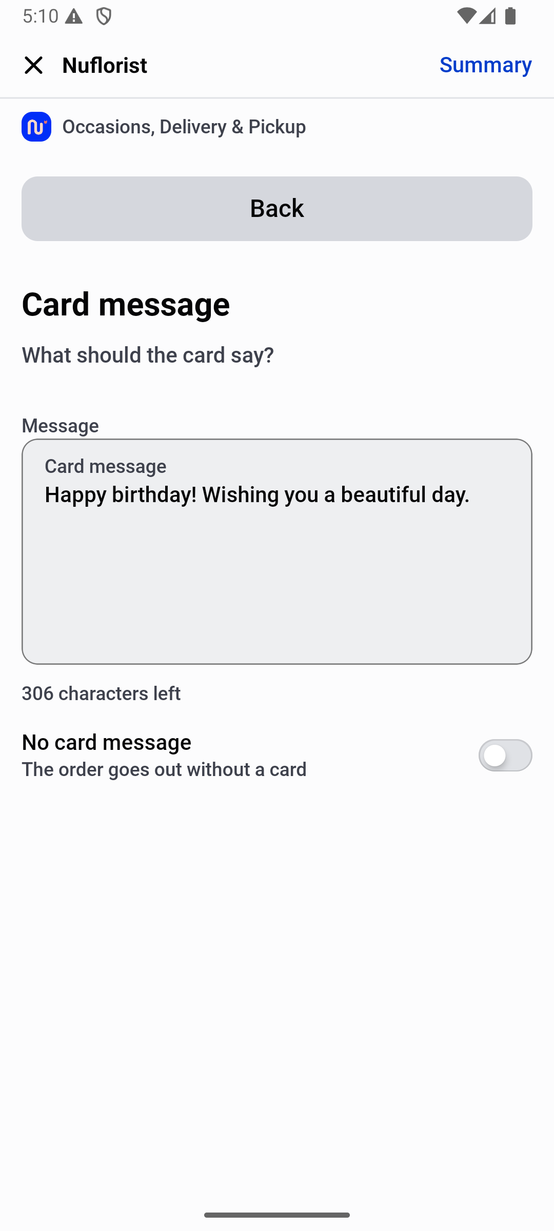
List the information your team needs to prepare the order: recipient, selected date and service, card message, occasion and delivery instructions. Decide where each detail is collected in your actual store, then check it on the saved order. Do not assume that displaying a field means it reaches the preparation team.
Use a fictional order to test a message with punctuation and an accented name. Check the intentional no-card path too. If you print cards, verify the printed output separately. Avoid collecting details you do not need, and keep private delivery instructions out of public screenshots.
Review the entire mobile journey
Start at the homepage, open a collection, choose a product and size, enter the gift details and review the cart. Test the back button and editing a selection. Check that text remains readable, buttons are reachable, images fit the screen and a promotion or cookie banner does not prevent continuing.
Resize and compress product images while keeping useful detail. Review unnecessary scripts and animations. Test on mobile data as well as shop Wi-Fi; a fast desktop preview alone does not establish a good phone experience. Keep a record of the device, page and problem so you can repeat the same check after a change.
Make contact details and controls easy to use
Keep your phone number, shop hours and contact options consistent across the header, footer and delivery page. Explain when someone can help with an urgent question. Do not imply that an unattended form is a live chat. For pickup, show the collection address and any instructions a first-time visitor needs to find the shop.
Use descriptive button labels, visible field labels and clear error messages that explain how to correct an entry. Try navigating with a keyboard and increasing the text size. Do not communicate an unavailable date or a required field through color alone. Give meaningful product photos useful alternative text, while keeping decorative images from interrupting the reading order.
Make the final review practical
Before sharing the site widely, ask a person who did not build it to place an agreed test order without coaching. Give them a recipient, occasion, budget and delivery date. Watch where they hesitate, then verify that the saved order contains the information your staff needs. Use a supported payment test process and keep the sample out of real fulfillment.
Prioritize problems that change the promise: wrong date, unclear fee, missing recipient or lost card message. Then improve navigation, readability and presentation. Repeat the relevant checks whenever you change the theme, order fields or delivery settings. A checklist you can rerun is more useful than declaring a design finished after one successful visit.